

Three steps
From a real place to pure colour

A photograph of Vernazza. The sky is lifted out, leaving the scene below it.
Source photograph via Pexels
Every colour in the scene is read and set in order. Five lead the palette.

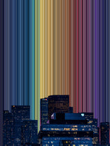
The colours rise as bands where the sky was. This is Vernazza.
Every Gradienta artwork begins with a photograph of a real place. In this example, the photograph shows Vernazza, a harbour village on Italy's Ligurian coast, at dusk. Houses rise above the waterfront, lights appear in the windows, and the surrounding sea is beginning to darken.
The source photograph is a stock image from Pexels. As with many Gradienta artworks, the finished piece takes its name from the location, keeping a connection between the artwork and the place its colours came from.
The three stages shown above follow the transformation: the photograph with its sky removed, the five main colours identified within the remaining scene, and the finished artwork. Each stage changes how the photograph's colours are presented while retaining part of the original view.
Removing the sky
The first step is to remove the sky. In a landscape photograph, the sky can occupy a substantial area and contribute strongly to the overall palette. Removing it shifts the focus towards the buildings, land, water and other features below.
In the Vernazza photograph, this leaves the harbour, houses and cliffs, together with the reflections and artificial light visible at dusk. These features provide the colour information used in the next stage.
Their appearance still depends on the conditions in which the photograph was taken. Stone, painted walls and water all look different as the light changes. The resulting palette therefore belongs to this particular view of Vernazza at this moment.
Arranging the colours
The colours in the remaining scene are then read and set in order. Within the photograph, small variations in colour help describe objects and surfaces: shadows beneath buildings, reflections on water and light falling across plaster. Rearranging those colours makes it possible to see their relationships more directly.
Five main colours summarise Vernazza's palette:
- #0F1719 — a near-black with a blue-green tint, recalling the dark water around the harbour.
- #73858F — a cool slate grey, associated with the shaded surfaces of the village.
- #C46114 — a warm rust orange, reflected in the illuminated stone and plaster.
- #154D67 — a deep blue that connects with the sea.
- #423B31 — a dark umber, echoing the cliffs and walls.
These five colours provide a useful summary, but the artwork uses the wider range of colours drawn from the photograph. You can see the five-colour palette beside each artwork in the shop. Selected colours also carry through into the Journal's design; this article uses Vernazza's rust orange for its links and headings.
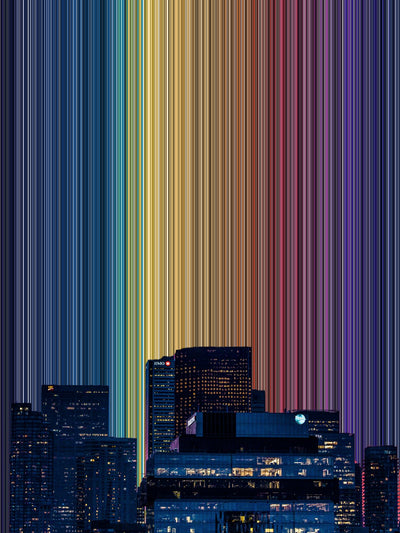
The ordered colours form bands above the remaining scene, occupying the space where the sky was. The village stays visible at the foot of the artwork, allowing you to connect the bands with the photograph they came from.
No additional colours are introduced during this process. The change comes from rearranging the photograph's existing colours and altering the amount of space they occupy within the composition.
What changes when colour is organised?
In the original photograph, attention can move between recognisable details: boats, windows, buildings and rocks. Their colours contribute to our understanding of the scene, often without being considered separately from the objects themselves.
The bands change that relationship. A colour that occupied a small area of the photograph becomes easier to notice, while neighbouring bands make differences in lightness, warmth and saturation more apparent. The retained village provides a point of reference for this more abstract arrangement.
The intention is to give the colours a clear structure while keeping their connection with the landscape. Some viewers may find the repetition and continuity restful; others may be more interested in the contrast between the bands and the detailed scene below.
Research into landscape preference offers a related question: how does the organisation of detail affect our response to an image? It provides a way to think about the composition, although it does not establish how people will respond to these particular artworks. The science of seeing explores that research alongside colour perception and emotional associations.
1 source photograph per artwork
5 main colours summarising each palette
3 canvas formats
48 artworks in the collection
From file to canvas
The finished composition is prepared as a high-resolution file. Each canvas is printed when an order is placed, using the print partner nearest you.
There are three formats, each giving the artwork a different edge and depth on the wall:
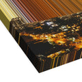
- Stretched canvas. Printed on 400gsm canvas and hand-stretched over 38mm-deep bars, with no surrounding frame.
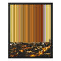
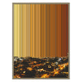
- Framed canvas. The canvas is stretched over slimmer 19mm bars and set within a frame, creating a defined boundary around the image.
- Float frame. A slim gap separates the canvas from its surrounding frame, making the canvas's edges and depth visible.
Consider the format alongside the artwork's size and the objects around it. An unframed canvas leaves the image itself as the visible edge, while the framed options introduce another element into the arrangement. The canvas guide compares the available formats, sizes and depths.
Explore the finished artwork
Vernazza, Luminous Echoes No. 006 is one of 48 artworks developed from photographs of real places. Its dark blues, grey and rust orange reflect the balance of natural and artificial light captured in the source image.
To compare its palette with other locations, explore the artworks by colour. You can also find related views in the coastal landscapes collection linked below.
For images and information about Gradienta, visit the press kit.
