
Journal · Science
The science of seeing: how colour becomes emotion
From three kinds of cone to the words we use for colour, how the eye and brain turn light into colour, and colour into feeling.

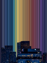
Colour is an immediate part of how we experience a place, although understanding that experience is less straightforward. In a photograph of a harbour at dusk, the warmth of the buildings may stand out against the darker water, while reflections connect colours that would otherwise appear quite separate. We can recognise the scene and form an impression of its atmosphere without consciously examining any of these relationships. How the visual system produces that impression, and how it acquires an emotional quality, involves several different processes.
Research into colour perception begins with the eye's sensitivity to light, but extends into questions about memory and the influence of language. Studies of emotional associations add another dimension, examining whether people from different backgrounds attach similar feelings to particular colours. Together, these areas help explain some of our responses to art, while leaving room for the personal experiences that make those responses differ.
How the eye distinguishes colour
Most people have three types of cone cell in the retina, sensitive to overlapping ranges of short, medium and long wavelengths. These are referred to as S, M and L cones. Each responds to a range of wavelengths, so describing them as blue, green and red receptors can give a misleading impression of how independently they work. The visual system uses comparisons between their responses to distinguish colours.
A single cone cannot determine whether its activity results from a change in wavelength or a change in the amount of light reaching it. Comparing activity across the cone types helps resolve this ambiguity. This three-cone system, known as trichromacy, also explains how different mixtures of light can look alike. If two mixtures produce matching cone responses under the same viewing conditions, we may perceive them as the same colour. These matches are called metamers and help explain how a screen can reproduce many of the colours in a photograph using red, green and blue light.
Nathans, Thomas and Hogness (1986) identified the genes encoding the three cone pigments, providing a molecular account of the light-sensitive components involved in trichromatic vision. However, identifying these components is only the beginning of explaining colour perception. The signals they produce undergo further processing as the visual system compares information across the image.
Some pathways compare long- and medium-wavelength cone responses, while others compare short-wavelength responses with a combination of the other two. These comparisons are related to opponent processing, commonly described through red–green and blue–yellow oppositions. Hurvich and Jameson (1957) developed an influential account of this organisation. A familiar example is the greenish after-image that can appear on a neutral surface after looking steadily at a red patch. Recent exposure changes the response of the visual system, affecting what appears next.
Colour information is also organised within the brain. Conway and Tsao (2009), studying macaque monkeys, found clusters of colour-tuned neurons, with neighbouring cells tending to prefer similar colours. Their findings describe part of the organisation through which colour is processed beyond the eye.
The sensitivity of this system makes the question of how many colours we can distinguish surprisingly difficult to answer. Pointer and Attridge (1998) proposed an estimate of approximately 2.3 million discernible colours, although such estimates depend on the conditions and the method used to define a visible difference. Our capacity to distinguish shades is considerably greater than the vocabulary we use to describe them.
Recognising colour as the light changes
The light reaching the eye from an object depends on its surface and the illumination around it. A white shirt reflects a different mixture of wavelengths beneath a warm lamp from the mixture it reflects outdoors. Despite this change, we can often continue to recognise the shirt as white. This relative stability is known as colour constancy.
Land (1977) explored this using arrangements of coloured papers under changing illumination. The light reaching the eye from a patch could be altered substantially while its perceived colour remained relatively stable. His retinex theory proposed that comparisons across the scene help account for this effect. The surrounding surfaces provide information that would be missing if the same patch were viewed in isolation.
Colour constancy allows us to recognise objects across different lighting conditions, but the adjustment is incomplete. Under strongly coloured light, the shirt may still appear tinted. Similarly, a colour taken from a photograph can look different when placed against another background. For an artist working with a photographed palette, changing the arrangement changes the context in which each colour is seen, even when the colour values themselves remain the same.
The influence of language
Although the visual system can distinguish a great many colours, languages group them into a much smaller number of categories. The boundaries of these categories vary. Colours given separate basic names in one language may belong to a shared category in another, raising questions about whether these differences affect how colours are judged and remembered.
Roberson, Davidoff, Davies and Shapiro (2005) investigated colour categorisation among Himba speakers in Namibia, extending earlier work with Berinmo speakers in Papua New Guinea. Differences in participants' colour judgements and memory followed distinctions within their own languages. This provided evidence that linguistic categories contribute to the way people organise colour information.
These findings are sometimes retold as evidence that the Himba cannot see blue. The research concerns differences in categorisation and performance on colour tasks; it does not demonstrate an inability to see that part of the spectrum. Having a word for a distinction can help us attend to and remember it, while the absence of a separate basic term does not establish an absence of visual sensitivity.
This is relevant when describing an artwork as simply blue or green. The name groups together shades that may differ substantially in lightness and saturation. It is useful for communicating a general impression, but examining the palette reveals differences that the description leaves out.
Do colours carry the same feelings for everyone?
Colour and emotion research examines how far our associations are shared. Jonauskaite and colleagues (2020) asked 4,598 participants from 30 nations, speaking 22 native languages, to associate 12 colour terms with 20 emotion concepts. The patterns were considerably alike across countries, with an average similarity coefficient of .88. Nations closer in language or geography also tended to show greater similarity, suggesting that cultural differences contribute alongside the broadly shared patterns.
A strength of this research is its inclusion of participants across a wide range of countries and languages. It provides a broader basis for comparison than a study conducted within one student population. However, the task assessed associations with colour terms. A person linking blue with sadness is reporting a connection between concepts; whether looking at a blue painting changes their mood requires a different kind of investigation.
Song and colleagues (2025) examined responses to colour samples in 72 university students, divided equally between art and non-art students. Orange received more positive emotional evaluations than blue, and both brightness and saturation affected the ratings. Differences between the two student groups were relatively modest. These findings show why describing a colour by its hue alone gives an incomplete account of how it may be evaluated.
The sample also places limits on the conclusions. Responses from 72 students under controlled conditions cannot establish how people generally experience those colours in their homes or within an artwork. A painting contains relationships between colours, recognisable or abstract forms, and associations that the viewer brings to it. Applying the findings to art therefore requires attention to what participants actually saw and what they were asked to report.
Warm and cool remain useful descriptions when comparing palettes. They can help identify a relationship between an artwork and the colours already present in a room. Personal preference becomes clearer when the particular shades are considered together and viewed in context, which is the approach taken in choosing wall art by colour.
How the arrangement of detail affects preference
Our response to an image also depends on how its detail is arranged. Lavdas and Schirpke (2020) investigated this using Alpine landscape images altered to change features including geometric patterns, the distribution of natural objects and building complexity. Their survey received 144 valid responses, with most participants living in Europe.
The findings supported a relationship between aesthetic preference and organised complexity. In several comparisons, participants preferred images containing structured variation across different scales. This gives some support to the idea that a detailed image can remain appealing when there are relationships between its larger and smaller elements. Removing detail is therefore not necessarily the most effective way to improve an image's composition.
The research measured preference, so it leaves a separate question about whether the preferred images also produced feelings of calm or reduced stress. It also used particular landscape scenes and manipulations, which makes direct comparisons with abstract artworks difficult. Its relevance lies in examining the organisation of visual information, an issue that can be explored in art without assuming the same outcomes.
Looking at colour in a Gradienta artwork
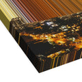
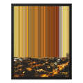
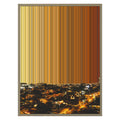
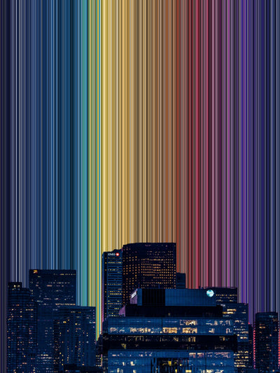
A Gradienta artwork begins with a photograph of a real place. The sky is removed and the remaining colours are arranged into bands above the retained scene. A shade that originally described a small reflection or part of a building becomes visible within a larger area, where its relationship with neighbouring colours is easier to examine.
This process brings together two ways of looking at the photograph. The scene at the foot of the artwork provides recognisable objects and a location, while the bands make its colour variations more apparent. You can follow a colour back towards its source, or look at how it changes in appearance beside the colours around it.
The studies discussed here help explain why the resulting experience involves more than the colour values in the file. The visual system makes comparisons, language supplies categories, and emotional associations contribute further meaning. The particular response remains something to discover through looking at the work.
To follow the process, read how a Gradienta artwork is made. You can compare the colours of 24 real places, or explore the artworks by colour.
Sources
- Conway, B. R. & Tsao, D. Y. (2009). Color-tuned neurons are spatially clustered according to color preference within alert macaque posterior inferior temporal cortex. Proceedings of the National Academy of Sciences, 106(42), 18034–18039. doi.org/10.1073/pnas.0810943106
- Hurvich, L. M. & Jameson, D. (1957). An opponent-process theory of color vision. Psychological Review, 64(6), 384–404. doi.org/10.1037/h0041403
- Jonauskaite, D. et al. (2020). Universal patterns in color-emotion associations are further shaped by linguistic and geographic proximity. Psychological Science, 31(10), 1245–1260. doi.org/10.1177/0956797620948810
- Land, E. H. (1977). The retinex theory of color vision. Scientific American, 237(6), 108–128. doi.org/10.1038/scientificamerican1277-108
- Lavdas, A. A. & Schirpke, U. (2020). Aesthetic preference is related to organized complexity. PLOS ONE, 15(6), e0235257. doi.org/10.1371/journal.pone.0235257
- Nathans, J., Thomas, D. & Hogness, D. S. (1986). Molecular genetics of human color vision: the genes encoding blue, green, and red pigments. Science, 232(4747), 193–202. doi.org/10.1126/science.2937147
- Pointer, M. R. & Attridge, G. G. (1998). The number of discernible colours. Color Research & Application, 23(1), 52–54. doi.org/10.1002/(SICI)1520-6378(199802)23:1<52::AID-COL8>3.0.CO;2-2
- Roberson, D., Davidoff, J., Davies, I. R. L. & Shapiro, L. R. (2005). Color categories: evidence for the cultural relativity hypothesis. Cognitive Psychology, 50(4), 378–411. doi.org/10.1016/j.cogpsych.2004.10.001
- Song, L., Zhang, G., Ma, L., Silvennoinen, J. & Cong, F. (2025). Comparative analysis of color emotional perception in art and non-art university students: hue, saturation, and brightness effects in the Munsell color system. BMC Psychology, 13, 650. doi.org/10.1186/s40359-025-03034-y
