


Journal · Guides
Choosing wall art by colour
Read your room's undertone, choose a palette family, size the canvas to the wall and try it first: a short guide to choosing by colour.
Choosing wall art by colour begins with understanding the room where it will hang. Wall colour is part of this, but the floor, furniture and changing light all contribute to how a palette looks in the space. Looking at these elements together can help you choose an artwork that feels connected to the room, whether you want it to blend in or introduce a noticeable contrast.
The following five steps take you through that process, from identifying the room's existing colours to trying an artwork on your own wall before you buy.
1. Look at the room's existing colours
Start with the surfaces that occupy the most space: the walls, floor and largest pieces of furniture. Do they lean towards warm colours, cooler shades, or a mixture of both?
Cream walls, warm wood and terracotta can give a room an overall warmth. Blue-grey paint, pale stone and cooler fabrics may give a different impression. These are starting points rather than fixed categories. An oak floor might bring warmth to a room with grey walls, while a blue sofa could introduce a cooler element to an otherwise warm space.
Light also affects how these colours appear. In the UK, north-facing rooms generally receive cooler, more indirect daylight, while south-facing rooms receive more direct sunlight. Artificial lighting changes the balance again, so look at the room at the time you use it most. An artwork chosen for a living room used mainly in the evening needs to work under its lamps as well as in daylight.
If you find it difficult to identify the undertone of a pale wall, try holding a sheet of white printer paper beside it. The comparison can make a yellow, pink, green or blue tint easier to notice.
2. Choose a palette that relates to the room
Once you have a sense of the room's colours, consider which you would like the artwork to pick up. Choosing a related palette can create continuity between the artwork and its surroundings. Introducing a contrasting palette can draw more attention to the piece, particularly in a room where the existing colours are similar.
The choice depends on the effect you prefer. A cool palette may feel restful to you, but it could also leave an already cool room feeling less inviting. Equally, warm colours can add variety without needing to dominate the space. Looking at the particular artwork in context is more useful than relying on a general rule about how a colour should make you feel.
Gradienta's collections provide a starting point for exploring these relationships:
- Warm tones include oranges, reds and golds. These can pick up existing warm details or introduce contrast to a cooler room.
- Cool tones include blues, teals and silver-greys. Look for connections with upholstery, painted surfaces or other details in the room.
- Earth tones include browns, ochres and stone shades, which can work alongside wood, linen and other natural materials.
- Golden hour draws on the soft, warm colours of sunset, offering another way to introduce warmth.
Each Gradienta artwork is shown with its five main colours. If your room already has a colour you particularly like, perhaps in a green sofa or a rust-coloured rug, look for it within an artwork's palette. The remaining colours can introduce some variation while retaining that connection.
You can also work from the artwork outwards, repeating one of its colours in a cushion, throw or vase. A small connection may be enough; there is no need to match every colour or replace accessories that already work well.
If you are choosing several artworks, a shared colour can help them sit together. Other relationships, such as similar shapes, framing or subject matter, can also connect pieces whose palettes differ.
3. Consider size and position
Colour is easier to judge when the artwork is shown at an appropriate scale. A small canvas on a wide wall may have less presence than you expect, even when its palette works well.
As a starting point, consider an artwork around two-thirds the width of the furniture beneath it. Above a two-metre sofa, this would mean an overall width of roughly 130 centimetres. A pair or group of artworks could occupy a similar width, including the spaces between them. Adjust this to suit the available wall space and nearby furniture.
Leave enough space around the artwork for its outline to remain clear. Eye level is a useful starting point for hanging height, although the position may need to be lower above furniture or in a room where you mainly view it while seated.
Each Gradienta artwork has a set orientation, either portrait or landscape. Portrait pieces can suit narrow walls and alcoves, while landscape pieces often relate well to the width of a sofa, bed or sideboard. Check the proportions of the particular space before deciding.
For the available dimensions, see the canvas guide.
4. Choose a format
The edge of an artwork affects how it relates to the wall and nearby objects. Gradienta offers three formats:
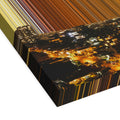
- Stretched canvas. Stretched over 38mm-deep bars without a frame, this format leaves the canvas itself as the visible edge.
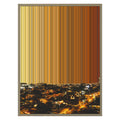
- Framed canvas. The canvas is stretched over slimmer 19mm bars and set within a frame, giving the artwork a more defined boundary.
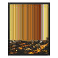
- Float frame. A slim gap separates the canvas from the surrounding frame, creating a sense of depth around its edges.
Consider how the format will sit alongside existing pictures and furnishings. An unframed canvas may suit one arrangement, while a defined frame may help connect the artwork with other pieces. The canvas guide compares the three formats side by side.
Each canvas is printed to order by the print partner nearest you.
5. Try it on your wall
On each artwork's page, open "On your wall", available beneath the size options and as a tab above the photos. Upload a photo of your wall to see the artwork at your chosen size. Your photo stays on your device.
Take the photo in the lighting you usually use, and include the furniture beneath the proposed hanging position. This gives you more context for judging the artwork's proportions and its relationship with the room's existing colours.
Compare a few palettes in the same position. You might find that a contrasting colour works better than expected, or that a quieter palette gives you the balance you wanted. The preview can help you assess the arrangement, although colours on a screen may differ from the printed canvas.
An example to work through
Consider a north-facing living room with pale grey walls, an oak floor and a grey sofa about two metres wide. The walls and daylight introduce cooler tones, while the floor adds warmth. A blue-grey artwork could continue the cooler palette. If you would prefer more warmth, a piece from the golden hour collection would give you something different to compare.
A landscape canvas around 100 to 120 centimetres wide, or a pair spanning about 130 centimetres, would be a useful starting point above the sofa. Try both palettes using a photo taken in the room's usual lighting, then consider whether either artwork connects with colours already present. If you want to repeat a colour in a cushion or throw, choose one that adds something you like to the room.
To explore how the palettes are developed, read how a Gradienta artwork is made, or compare the source locations in the colours of 24 real places.
