
Journal · Colour study
The colours of 24 real places
Twenty-four places, five lead colours each, compared for warmth, vividness and light. The warmest is Monterey; the coolest, Alaska.
Overview
Each place's five lead colours, compared for warmth, vividness and light in a standard colour space. One photograph is one moment: the same place at another hour would read differently.
The warmest places


The coolest places


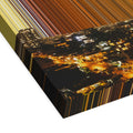
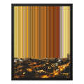
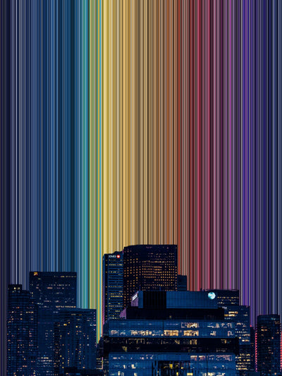
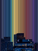
Twenty-four Gradienta artworks take their names from the places shown in their source photographs. They include harbours, cities and mountain landscapes, from Monterey on the Californian coast to Troms og Finnmark in northern Norway. Each artwork has five main colours, allowing us to compare the palettes and explore how they differ in warmth, vividness and lightness.
The photographs represent locations across 13 countries. Five are in Italy and five in the United States, while Brazil, Peru and Türkiye each have two. Even within one country, the palettes vary considerably. The Italian photographs, for example, range from the warm rust colours of Vernazza to the stone greys of the Dolomites.
The palette display above arranges the artworks from warmest to coolest. The table below includes all 24 and allows you to sort them by each of the three measures.
The warmest and coolest palettes
Monterey has the warmest palette in this comparison. Bright orange (#E7672F) and soft apricot (#FAAD67) sit alongside deep browns drawn from the rocks and shore. Ankara follows, with a strong red-orange (#D94323), rust and near-black. In third place, Budapest brings together golds and creams (#CB8C59 and #EDCE9C) from a city photographed at night.
At the cooler end, Alaska combines ice blue (#A9C0D3), near-white (#E6ECF3) and deep teal. Switzerland follows with dark blues ranging from #091728 to #3E4455. Newfoundland is third, with slate and grey-blue shades, including #8AA5B7 as its lightest colour.
These differences reflect the conditions captured in each photograph. Warm light contributes to the palettes of Monterey and Budapest, while snow and ice shape Alaska's colours. The comparison therefore tells us something about the particular view and lighting, rather than establishing a characteristic palette for an entire location.
The most vivid and muted palettes
Vividness describes the strength of colour, which is a separate quality from warmth. A palette can be cool and vivid, or warm and muted.
Ankara has the most vivid palette, followed by Grimes Canyon in California and then Monterey. In the Grimes Canyon artwork, red rock (#A74133) and burnt orange (#E18651) contribute to the strength of the palette.
The Dolomites has the most muted palette. Its stone greys (#BDC3C8 and #9D9590) and earthy browns show relatively little saturation. Italy Mountains follows with soft greys and pale blush (#D7CAC9), while Newfoundland is third.
For someone choosing an artwork, this distinction can be useful. A muted palette may be easier to combine with existing furnishings when you want subtle differences in colour. However, its presence on the wall will also depend on the artwork's size, composition and contrast with its surroundings.
The lightest and darkest palettes
Alaska has the lightest palette, followed by Veneto and Italy Mountains. Veneto combines lilac greys with a soft coral (#CE817B), giving it a different balance of colours from Alaska despite both appearing near the lighter end of the comparison.
Switzerland has the darkest palette, followed by Istanbul and Newfoundland. Istanbul brings together deep blues and charcoal with a brighter teal (#226D82).
Some palettes appear near the extremes of several measures. Newfoundland is among the coolest, most muted and darkest, while Alaska is among the coolest and most muted as well as being the lightest. Looking at the measures together helps explain differences that a single description, such as “cool”, would leave out.
How the palettes were compared
The comparison uses the five main colours shown for each artwork, assessed for warmth, vividness and lightness in a standard colour space. The rankings summarise those selected colours; they do not measure every colour in the source photograph or describe the full range of colours found at the location.
Each measure answers a different question. Warmth compares the palette's warmer and cooler qualities. Vividness compares the strength of its colours, while lightness compares how light or dark they are. The table allows you to consider these qualities separately and see where they overlap.
What one photograph can tell us
Each source photograph records a particular view under particular conditions. Changes in daylight, weather, season and framing could produce a different palette from the same location. A harbour photographed at midday may contain different colours from one photographed at dusk, just as autumn vegetation can change the balance of a mountain landscape.
If you know one of these places, the palette may differ from your own memory of it. That difference can be interesting in itself: which colours do you associate with the place, and which features of the photograph might account for the difference?
The table below brings the 24 palettes together. Sort by warmth, vividness or lightness to compare them, then follow a location through to its artwork to see how those colours are used.
To explore colour perception further, read the science of seeing. For help relating a palette to your own room, see choosing wall art by colour.
Every place
| # | Place | Palette | Warmth | Vividness | Light |
|---|---|---|---|---|---|
| 1 |
 AlaskaUnited States |
-17.0 | 15.5 | 59.2 | |
| 2 |
 AmsterdamNetherlands |
14.1 | 18.6 | 39.8 | |
| 3 |
 AnkaraTürkiye |
29.3 | 28.5 | 36.5 | |
| 4 |
 ArequipaPeru |
24.5 | 22.6 | 40.5 | |
| 5 |
 BlumenauBrazil |
13.7 | 13.0 | 44.5 | |
| 6 |
 BudapestHungary |
27.4 | 25.6 | 41.6 | |
| 7 |
 DolomitesItaly |
4.9 | 6.1 | 44.1 | |
| 8 |
 FlorianópolisBrazil |
19.1 | 17.6 | 35.6 | |
| 9 |
 Grimes CanyonUnited States |
27.3 | 27.9 | 47.0 | |
| 10 |
 IraqIraq |
8.5 | 9.0 | 32.8 | |
| 11 |
 IstanbulTürkiye |
-8.2 | 11.3 | 29.7 | |
| 12 |
 Italy MountainsItaly |
-4.8 | 6.3 | 48.4 | |
| 13 |
 JakartaIndonesia |
7.4 | 12.6 | 41.8 | |
| 14 |
 LayoPeru |
13.5 | 12.9 | 32.9 | |
| 15 |
 ManarolaItaly |
19.2 | 18.5 | 41.6 | |
| 16 |
 MontereyUnited States |
29.7 | 27.2 | 39.5 | |
| 17 |
 Mtskheta-MtianetiGeorgia |
9.6 | 23.4 | 36.8 | |
| 18 |
 New York CityUnited States |
-8.8 | 12.1 | 34.4 | |
| 19 |
 NewfoundlandCanada |
-9.1 | 8.1 | 31.1 | |
| 20 |
 San FranciscoUnited States |
-1.3 | 18.4 | 45.5 | |
| 21 |
 SwitzerlandSwitzerland |
-11.9 | 13.2 | 22.4 | |
| 22 |
 Troms og FinnmarkNorway |
14.2 | 14.0 | 31.8 | |
| 23 |
 VenetoItaly |
0.8 | 14.5 | 52.9 | |
| 24 |
 VernazzaItaly |
8.8 | 21.6 | 33.9 |
